Monday, 30 September 2013

Graphics - Final Piece

20th September


For this poster I used the effect of cutting the paper into strips and separated them out a few centimeters away from one another once I stuck them down in the right placement I filled in the gaps using felt tip pens and colouring pencils so that the poster would look blurry, alien (different) than before as in the furture is blurry and not clear as we don't no what will happen. 

If I could change anything for this main piece I would of changed some parts of the layout to make its appearance more like a poster for a gallery as it just looks like a normal picture also make the text more clear as it is difficult to read. The poster looks more effective from a distance because the strips of paper blend in with the filled in gaps, when looking at it closely you can tell where the placement of the strips of paper are.


Emma Kay 
Neil Stevens 
Sam Winston


Winston's work featured in the Memory Palace in the V&A up London. His work is based on the text by e author Hari Kunzru which many illustrators and designers worked on a particular section of his writing. It focuses on mankind's worship of the periodic table looking a the science of modern chemistry and the imagery of scared eastern geometry.

Sam Winston [online] available at http://blog.stylesight.com/graphics/sam-winston-memory-palace


Sunday, 29 September 2013

Lens based Media photos of storyboard

25th September


These are images representing the stages of creating the characters I used for the (Spider) storyboard.


This was the brush I used to create the characters in the story.


For each character I used a hair brush and wraped celitape around it with the sticky side up, once the hair brush was covered I then wraped the celitape round it again but the sticky side down so that the celitape would create a solid mould. After I wraped the celitape round the hair brush I then cut a slit on the side of the mould so I that I could take it off without damaging the structure. I used the same skill for the legs on the spider using a paintbrush instead of using the hair brush. This technique was also used fort the arms of the old lady, the other body parts I used the hair bursh to make a dress like shape.


In my opinion the structure of the spider needed to be improved as the mould looked abit flat. I used more celitape to create a more 3D realistic appearance 


To make this spider look more realistic I used black paper and cut a zig zag pattern out so that it would look like the hairs on a spider's back. I repeated this technique to cover the whole mould of the spider.


For the old lady I used the same techneies as before.


The house  was a paper cut out which was stuck onto a box to create a 3D appearance which would look realistic for the storyboard.

Theses are the photos of the storyboard.


The outcome of the storyboard I thought looked ok by still needed to be improved as each image looked too unrealistic and there weren't enough diverse camera angles. In future I would use a different technique so that the storyboard would look more realistic and smoky as the images didn't reflect how scary the spider was or how worried the old lady was, also the storyboard wasn't really clear for the second image didn't clearly reflect the husband being wraped up in the webs as he didn't make an appearance in the first image.


Lens based media improvement on storyboard

26th September

Instead of using the same method of using 3D celitape model I used people and places from magazines to represent the protagonists combind with drawings from my bamboo tablet to create a different effect from before, depicting a more spooky scary. 
Other changes I have made are the age of the protagonists. I thought people would connect more to younger characters as more younger people experience 'true love'.


Greg and Claire 

The legand of the big spiders, they appear every 21 years, if you lay eyes on the spider you have to kill them otherwise you turn to dust.  But Greg and Claire didn't know this...


Claire and Greg were sitting down having Chinese celebrating Her 21st birthday.
About an hour into watching a film their was a strange scratching noise coming from the other side of the door.
 

Greg got up very slowly to check what was behind the door. As He opened the door there stood a     
Gigantic hairy spider. Before he could do anything the spider grabbed his arms and legs to restricted him from moving. A few minutes after all that was left of Greg was just a web of corpse laying down on the floor. 


Out of fear and sadness of losing Greg, Claire decided to kill the beast with an axe.


All of a sudden the webs that were left by the gigantic spider started to move. A few minutes later yet another spider appeared but this time wasn't the same as before...instead of another normal gigantic spider because the gigantic spider didn't kill Greg when he was consumed in the the webs he transformed into a half spider half man creature.


What Claire and Greg didn't realise because Clarie didn't kill Gerg (as he was part spider) she turned to dust to save the love of her life without living a lonely life without him.

Patrick Keller
Christopher Nolan (director)

Diane Arbus


Arbus was born on March 14th 1923 in New York and died on July 26 1971 she was an American photographer and was the writer noted for black and white squared photographs 
Originally she started out as a fashion photographer she also appeared in he magazine of Vogue. She then began to take photos of people she found e.g. Seedy hotels, public parks, a morgue and other locations. 

Diane Arbus [online] available at http://www.standard.co.uk/news/standard-pictures/diane-arbus-revelations-7335534.html?action=gallery

Wednesday, 25 September 2013

Lens based Media Storyboarding

24th September 

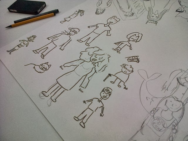
For this task I had to work I'm a group creating a series of characters (people we have seen in the passed) friends, family etc... 

We had to draw people representing:

* what people stand out straight away fro you
* who impacted your life in a bad way
* who is your hero
*what person would you wanna be
*your favourite place
* the worst place to be in your opinion
*who wouldn't you like to look like


There were a variety of characters to choose from so when it came to creating the short stories it was a lot easier to discuse and plan. 


After we created the whole page of characters we then decided as a group to create three short stories about:

*an old lady alone in the world which was filled with spiders
*a hippy at a festival accidentally dropped his fag on a dog which then lit up the dog! a fat ugly lady walked past with a Burette and used the dog as a 'hot dog'
*about a fat man that ate and ate snd ate until one last kit kat and exploded.  

There were six boxes for each storyboard the first box needed to show the introduction to the characters within the story and a small problem, the next three were the struggles through the problem and the other two where the outcome of the struggle wheather it be a cliffhanger, happy ending or a horrible ending.


The task was sussesfully as within a group we came up with unquie clever ideas for a particular character and for the three short story boards.
 In my opinion even though the spider story had a problem, struggle and solution it needed to be more simplistic as I found when we were discussing the story there was to many elements within the story and needed to be changed so for furture reference the storyboards need to be more clear to reflect each part of the story, beginning (problem) middle (struggle) and end  (solution).
The best story that depicts this simplistic beginning, middle and end was the story with the man that couldn't stop eating, it shows a direct message, each section showed the right elements throughout the story without any unecessary sences we didn't need.