Adobe Photoshop CS6
Adobe Illustrator CS6
Adobe Indesign CS6
This was the picture I used in the foreground for the poster.
This was the background I used, This image was from the musical Wicked.
I used Photoshop for this image using The path selection tool (what line to select) was to select the right line around myself before erasing the picture, the eraser gradient tool to remove the exes parts around my face and body. move tool (arrows) where used to create a crisp outline around me.
text (on arch) and other shapes e.g. Star (as the image depicts). After using this method by selecting the font by the move tool (arrows) I created a spiky font by selecting one part of a letter and stretching it out.
I used the illustrator program using the selection tool, ellipse tool (shapes), the scissor tool to cut lines and the type (text) on a path. The logo at the bottom left of the image was the first idea I wanted to use when I was experimenting with the logos; the logo ontop was by accident. I was trying to curve the lines around so that it would look like the logo under neither, instead it created swirly lines which then I drew my initials to create a unique logo.
As the background on the poster was mainly black I change the colouring of the logo so that it is clear to notice.
This is a screen shot of the image before the chosen logo and text was chosen.
I added the logo to the background
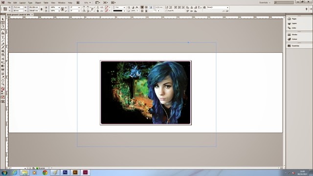
For the poster I used Indesign using the selection tool, direction tool and the the text tool.


No comments:
Post a Comment