Friday, 25 April 2014

Miss-Leading - Peter Pan and tinkerbell designs


Peter Pan and jigsaw from Saw,2004, film, have some similarities, they both like to plays games including death, 
I could perhaps illustrate over the top of this design as I feel that it needs some of my drawings skills to portray a personal message to the audience.


These images were to dipicts the sence from the origal story of tinkerbell, that she was transformed in a fairy in a sunflower field I would be using some oft he tecniques from the book: the secret fairy party book  (Dann, 1999) and the secret mermaid handbook (Dann,2003) as they show some good pop up techquies which I could use for my interpretation, this will give my creation to be more interactive so e audience will be more attracted to the piece.

Miss-Leading - Cinderella


Authors own 

After my inital research from dreams I thought I could combind what the dreams symbolise with the origal fairytales.

E.g. For Cinderella if it was a dream there was...
Mice: to much time dwelling on minor problems 
- eating something is trying to bring you down your self confidence (like the step sisters did to Cinderella) nipping away at your resources.
- fear, weakness lack of assertiveness not messing up 
- hidden in the shadows of something else

Pigeon: taken the blame for your actions of others 
Gossip news
Carry a message from your unconscious
Expressing a disire to return home

Tree: new hope (like cinderella's mother) growth, desire, knowledge and life, strength, protection and stability 
Concentrating on own self development individually 

Bare tree: used up engery (mother is dead) put all in a relationship (also relates to Cinderella) 
Feeling depressed
Circle of life, passage of time.

Sleeping beauty
Sleep: letting oppaturnities pass etremal beauty that you are oblivious to. ( likewise to sleeping beauty)

Rape: vengeful, resentful feeling towards the opposite sex,
Violated taken advantage of something or someone jep self- esteem 
Emotional wel being forced apon

Baby: innocence warth, new beginning inner nature is pure

Authors own 

With is in mind I focuses on the Cinderella story to develope my 'eye' photos even further. 
I took the information from '- mice eating something is trying to bring you down your self confidence (like the step sisters did to Cinderella) nipping away at your resources.' And ': taken the blame for your actions of others (the reaction that the sisters made from cinderella's happy ever after), 'Expressing a disire to return home' could mean they wanted things back to how they used to be or perhaps it could depicts when the prince ordered the pigeons to peck their eyes out he wanted them to go home and not return?
This is also a design I could develope more maybe an interactive approach to this idea?


Thursday, 24 April 2014

Miss-Leading - Cinderella designs

Ted talks 
Aparna rao 
High tec art 

The uncle phone 
A long old fashion phne
She made a golden type writer altomatically send the letter

Trible sweet creatures which hide (e.g. Spoons) scared when sound is created 

Invisable camra one person invisable

Callapsing blob. On wall

Fur with lights teddy bear hole in the celiing looking up in the sky. 

This video inspired me to create a unquie approach to my work to make it stand out more. 


Authors own 


I wanted to create a interactive piece of art in a simular way to (Bech.T, September 2010, Catch me Now, 26/09/13) was presented at Watermans Arts Centre from August until October 2010 and featured in the V&A (Victoria and Albert Museum) during Design Week. this product is a spotlight which once it detects someone within the spotlight it becomes bigger so it's like your physically catching it for it to stay. After a few minutes it then disappears to another place, it then repeating this same process. This device is comprised using DMX Cable-DMX to USB- USB Cable- PC open CV blob anal/programmed by Turin-USB Cable-Web Cam. As this looks like a product for children many adult take part in this unusual behaviour.  

Also this relates back to the glow in the dark tea pot by Tine Bech also interactive for childrens? Adults?

Authors own 

Authors own 

Authors own 

Could use these photographs and combine it from the idea of 'the bird in the bird cage'
This idea was used on the eyes I created from Cinderella to show even further that the pigeons contra oiled the step sisters eye site.
This idea can also dipicts how miss leading the posion was in the apple that the queen gave to Snow White the apple only made Snow White fall into a deep sleep (that is why she woke up when the prince kissed her) she wasn't really dead. 


Authors own 


Authors own 

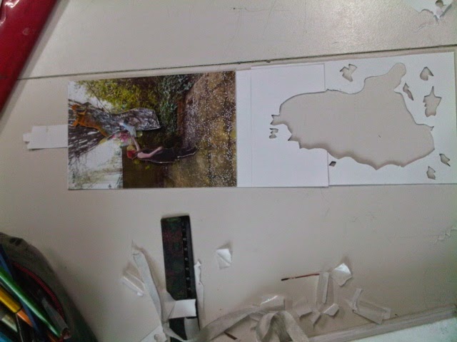
These are photos displaying the net of the Cinderella sence I was re creating I used white card and the photos I used previous to make the story more realistic also is interactive likewise to Tine Bech and engages the audience to look more closely in this piece.


Friday, 18 April 2014

Miss-Leading - Home (work) Tree character

After the creative making week I was inspirered to create 3D features for a particular character from the origanal story of Cinderella. This particular idea was from the tree that Cinderella planted symbolising a metophor for the tree being her mum always being there when she prays.
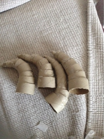
After these horns dry I will then do another photoshoot for this particular character.


This was the technquie I used for my horns monkeynumber5,2013,http://monkeynumber5.deviantart.com p unknown

Authors own 


  I first found an empty wrapping paper tube to cut up into small hoops.

Authors own 

This was to then be the basic pieces for the horns. Once I cut out all the small hoops I then cut a slit into each hoop so it would start to create the shape of the horn.

Authors own 

This is a photo of all 4 horns finished for the paper Marsha to be stuck down.

Authors own 

Authors own 


After the paper Marsha was dry I then painted over it to create a bark like appearance not only using paints but black marker pen to indicate the texture of the 'bark' after looking at them I thought about improvements which could be make, I could of used torn brown paper to make the texture of the horns appear more or in the photo shoot I could use actual sticks and twigs to make the photo look more realistic.


The Design Muesum

Authors own 

Figure 1 

Figure 2

Figure 1 and 2 from - Holliday, Amy, 2013, amyholliday.blogspot.co.uk

This structure was based in the gift shop of the Design Muesum it gave me the idea of making a tree in the same was relating back to the 'Cinderella tree' also relating back to amy holidays 3D structure of sleeping beauty,1959, film (made out of paper, card and a doll).

Authors own 
Authors own 
Authors own 
Authors own 

These two photos gave me the idea of perhaps hanging my creations on the ceiling to create a illustrative 3D structure that could interacte with the audience. 

Authors own 
Authors own 
Authors own 
Authors own 
Authors own 

This plastic mould reminded me of alice in wonderland (the white rabbit) even the hole could perhaps relate to the hole which Alice fell down?

Authors own

Authors own 
Authors own 
Authors own 

This poece of art work reminds me of the art work from the Tate this technquies could be used for a background.

Authors own 
Authors own 
Authors own 
Authors own 
Authors own 

These notes were based on the over voice which was played in this section of the gallery.Paul smith - shadow camra is like a visual diary fabric patterns. Milarty clothes (inpirtation) street markets favoure places 
Ideas anything around you 
Latral thinking 
Design in words note taking
Don't look at other peoples work to much
Hot bright colours 
Dark room develop photos
Takes camra everywhere

Authors own 
Authors own 

This image from Paul Smith's painting/photo collection reminds me of the pigeons eye and the tree with eye illustration I created. I could perhaps develop the illustrations I have already created into a simular appearance as this image?


Authors own 
Authors own 

These two photo/illustration relates back to the ironic theme that I have researched also comes under sarcasmon. So it can be used in a more general aspect to illustrations.

Authors own 

This quote links  back to the feminist work of Margret Harrison and Tracy Emin.

Tracy Emin - hate and power can be a terrible thing 2004
Textiles

the exhibition I went to (2013) of the schmidheiny gallery includes the theme 'about the subvert materials feminine craft and domestic sphere addressing gender division and political themes' based on level 4, room 8. 
This theme relates to me on a personal level as I'm a female and my generation has evolved through this history of the movement.
My first reaction of the room automatically stood out for me as all of the art work was in different media among the use of bring pinks and blues.
The layout of the room isn't in chronological order but the work starts from the art work by annette messager (aint clock wise) - 'the pikes' (1992-3) my first reaction for me depicts death the textile pieces and dolls represent heads on sticks, this is juxtaposed the other art work from the harshness of the dark colours which Messager uses to the bold pinks in Margaret Harrison and Tracey Emin.
Margaret Harrison - homeworks (1977) this piece in particular I fould very interesting as it uses more than one media combining fine art (hands) and textile samples creating a collage like appearance.
The message 'homework: homeworkers (1977) by Margaret Harrison reminds me of it being a chore likewise to written homework students have to produce. Other messages occur on this piece e.g. Exploitation, discrimination and woman. Other artists around the room include the work by rosemarie trockel - untitled (1986) made from wood and acrylic, also tracy emin - 'hate and power can be a terrible thing (2004) there are strong messages depicts in here e.g. 'Permission to fire', 'the worst I could do is betraye', 'I hate women like you', 'rot in hell', 'you have no idea of faith', 'you cruel heartless bitch', 'there's no one in this room who has not through of killing', although these messages reflect depressing cruel message but then are juxtaposed by the colour scheme as Emin uses bright bold statement colours (pinks perhaps representing women)these pieces inspire me to create something out of the ordinary.   

Authors own 

These object made me think back to the rose in beauty and the beast,1991, film


Authors own 

This illustration in the designs of the year in the making section of how Id picture what the tree would look like in Cindellea.

Authors own 
Authors own 

Figure 3 
Figure 3 from - Kenter,5/7/10,www.spankystokes.com/2010/07/jeremiah-ketner-sdcc-2010-and-beyond.

This piece of art work was by Kid Robot (2006). He invited Paul Smith to a customise it's dunny, a curvy buny with a smooth face. The 'dunny' is a black canvas designed to be repainted and reinterpreted by artist from mNy different backgrounds. Smith created a 3" and 8" version under the Paul Smith jeans label along with limited edition t-shirt.

This object reminds me back to a simular idea which jerimah kenter created he created not only 3D moulds for his own designs but of stitch in LILO and stitch (Disney) making stitch look completely different from what he originally looks like.

Monday, 14 April 2014

Miss-Leading - Cinderella designs

Miss Clementine 

Teach in Ravensbourne
Intro in it

How people work 

Virgin media is a client 
Work with Lots of different people

- Campaign 
- what's the product
- offer
- concept
- audience
- format
- deliverables why?
- budget/deadline 

Logo
Grid
Colour 
Messaging tone of voice to communicate
Typography
Imagery
Icons
Graphic devices
Illustration 

Turn it on (Virgin media) 
Wire frame sketches (beginning) planning content and messages
Adversing 

Online
Prints
Bages
Leaflets taken to avents
Always on the same journey (a similar layout) 

The village England 
Starting up a women's handbag company 
Market research 
Bird icon? 
Old fashion fonts (melt signs) on the fire place sence of craft 
Identity stationary, online to grow as a business
Print making? Suttal looks European 
Watercolour design hand gen typography 
Very illustrative logo led into a pattern boarder? External walls of a shop
Melt stamp for the bags 
Signs for inside the shop
Photoshoot
Video  the bag changes


I made this image I created relate back to the little mermaid, the little mermaid,1989,film. Using  the ending of the story as te little mermaid turned to foam as she couldn't kill the prince and stay as a human. I have used shells, pebbles and blue algansa material to create a sea like appereance over the top of the photo of me (me symbolising the little mermaid turning into foam) I also used an app on my ipad to enhance the feature by adding glitter affect linking to the glisten of the sun bounce off the surface of the water.

Figure 1 


Firuge 1 shown in unknown,2013, fixatedonfashion.tumblr.com

Authors own 

I used the inspiration from a image on tumber in my interpretation I used face paints as it is easy to apply and get the right textures I was looking for to display the particular look in this case of a pigeon as after my illustration of the two step sisters I thought I could portray this same sence through a different media. I choose photography as the starting point of this design as in one aspect of this media it portrays or the viewer that this photo is real? Being miss-leading at first glance.


After the crit and peoples feedback to what I had done so far; with the eyes could make a minie film this lead me to think of a small animation to make the eye move to create the dark element to the original story.

Feedback from my mum at first glance her reaction creeped her out as it looked very weird and spooky 
This was the reaction I was hoping to get from an audience.