Wednesday, 27 November 2013

Branding - milkshake 2

27th November


This image shows a spider diagram of a brand inparticualr. In this case 'Google', as a group we thought about how this brand issucsesful etc. Google appeals world wide, using playful colours which are suitable for all ages. Depending on a particular day such as st patrics day the logo can change as this advertises different events. 


These designs of the bottle for the milkshake, from the pattern I used in the other packaging I created  a Male and female versions of the desgin. This could perhaps be the starting point for the mascot for the brand.


I then thought about how the stand would look, I thought about the unusal creative stands and restraints which are around today to help me to have a greater understanding of how to layout my stand.


I then thought about how the uniform would look when selling the product.


From this image I thought about how this would help enhance with my packaging I then thought about changing the chocolate with a popcorn so that the image would relate back to the name of my brand so that the popcorn would be shaking hands with the milk to create 'Pop Shake'.


I felt as these designs for the stand were sucsesful as I used exsisting milkshake shops enhancing my designs further so that they would be more apple allying for the target market. But I need to consider all types of shapes for the stand as I don't want it to be to predictable.


Tuesday, 26 November 2013

Branding - Milkshakes

25th Novemeber


This project was using a food/drink to brand, using designs for a brand logo, packaging, the stand perhaps a mascot and giftcards.
I firstly made a spider diagram about ideas for different foods I could possible brand, the target market and possible designs for the packaging and logo.

I settled with the idea of combinding popcorn with a milkshake as from my research I found a combination of popcorn with milk my first thought was to create a cereal but relised there wasn't a gap in the market for ceral as May brands have already taken this food. I then thought of merging popcorn with a milkshake.

For the name I used the 'pop' from popcorn and 'Shake'  as the name reflects what the food is.


For the intital designs for the logo, this desgin in particular relates back to the drink like the name does for one side I made it look like popcorn which you would get in a cinema. The other side I used a cows udders to link back to milk (milkshakes).


This was another design using the design above adapting that ordinal design and improving it.


I used a cows head within this design, the nose I made into a piece of popcorn to still merge the to products together.


The krave packaging was the starting point for my packaging of my product this made me think of how the brand could expand into different foods such as ceral creating more products under the same brand likewise to Dairy Milk.


I thought of many ideas for a few foods/drinks I think I have settled with a good drink to brand for as I'm my opinion there is a gap in the market for this type of product as many places don't sell milkshakes especially as urban street food you don't come across milkshakes at markets.
I felt that combindimg popcorn and milkshakes together was a good idea as many people haven tried this combination and if given the chance would pay for this kind of product.


Thursday, 21 November 2013

Fashion & Textiles - real presentations

21th November 


I felt that I didn't present my work as well as I could as I was to nervous, I also didn't say all of the techniques and ideas that I encountered when experimenting with different designs for the same reason. In future I need to be more confident with talking to a big group of people as this will improve my designs by explaining my work well and to make other people understand where my designs came from. Over move I would of made more slides depicting all of my work as other presentations that the other groups did in my opinion were more presentable.


Wednesday, 20 November 2013

Fashion and textiles - presentation planning

20th November 


We had to sort out the gift bags putting more objects in them so that the audience would apreieate e gift bags more so we added crayons and other objects.


This is what the look book looks like the top image shows the front page and the one underneith shows e back cover.

On this day the whole group made sure we got every thing ready for the presentation for tomorrow 
As don't want to rush around at lst minute.

Textures 
Prints
Techniques (photo shop) 


Tuesday, 19 November 2013

Fashion & Textiles - prints and promotion

19th November 


This is a sample which Steph (menswear) created. 


From the image above, the elephant picture reminded me of a pocket, with fabric and embroidery treads this depicts another way or using the print gaining more garments out of this technique.


These are the survival guides to fashion wraped up in ribbon so that they will be presentable in the gift bag. 


These are the gift bags we needed to prep for 100 bags as there were 100 people as a whole group.


Thursday, 14 November 2013

Fashion&Textiles - Group work

14th November


After cresting the first designs for the prints I them went back and used my own drawings so that I could scan them into the prints making more patterns with them. I used the same concept as before merging African animals with British ones, in this case I merged a giraffe and a horse together to create another weird creature.  


I then took the designs from the women's and men's wear so that I could apply my design onto the garment to see what they would look like.


Using my own drawings for the print has make my prints look more effective and has enhanced my designs.


Tuesday, 12 November 2013

Fashion&Textiles - group work

12th November 

These are the list of designers which I had to choose to create a collection for...

Burberry: british brad established 1856 thomas burberry, 
Kate moss adv changed
Changed from trnch voat to black and white 
Fiction trench for trenchs in war bage ofishal colour
Lizzy jagger 
Corpret enviorement 
Branding very impohaymarket check /trench coat
Not over used 
Cara edie jordan 
British themes gardens the weather artist music
Outerwear
Parkas blazers 
Colour pop slim siloette 
Quercky style

Comme des garcons
1969 44 yrs old 
1978 fist menswear line 
Play suits shirts and tricot 
Art combinding fashion
JuNya wantanabe working for her give him his own line 
Dover street market: married to a brtisish guy buy her garments from there 
Used in mags 
Stricked how her line is presented 
Dismisive on other designers 
Don't care wat the sesion is works in her little bubble 
Completley dif
Uses Body shape poka dot stripes now softer colours 
Natraul and modern fibres 
2012 collection bright colours flat construction 
Talioring 
Visial construction 
Minipulation 
Blackand white 
Stripe troues looked like the holicost so had to remove this idea 

Mary katranzou
Colour 
Floral patterns 
Womenswear
Walking works or art
Bright bold prints
Topshop collection 
Enterirar surface design 
Personal objects
Thmatic collections
Knitwear
She don't wear colour she expresses through her designs instead

Prada
Established in 1913 a largish com
With the use of blacK nilon
Italian brand 
Fur emberlishment and art
Socks ember
Alien like
Autum winter 13 campan 
Men and women
Bags make up most
Teed leather augator
Retro morfern fresh way
Rich vs poor throughout all of hjer work
Mu mu nickname 
Accessories important 
Prints pjs socks 
Digial prints 
Floural prints full skirts with knit
Lady like sheek 
1950, 40, Etcc
Steven meisel campaigns


Jw anderson
New young designer 
Clab with top shop 
Pattern and shape 
Men and womens where 
Womens structed wear
Gridded jumpers
Detailing mixing things up flourses with strips 
Mascling and fem mixed together 
Caracture changing character when wearing the clothes 
Texture 
Knit wear
Hates dresses
Layering 
Skirts over trousers
Check is key


I was selected to colaborate on J W Anderson's designs, also to be the textile desginer e.g. Prints.


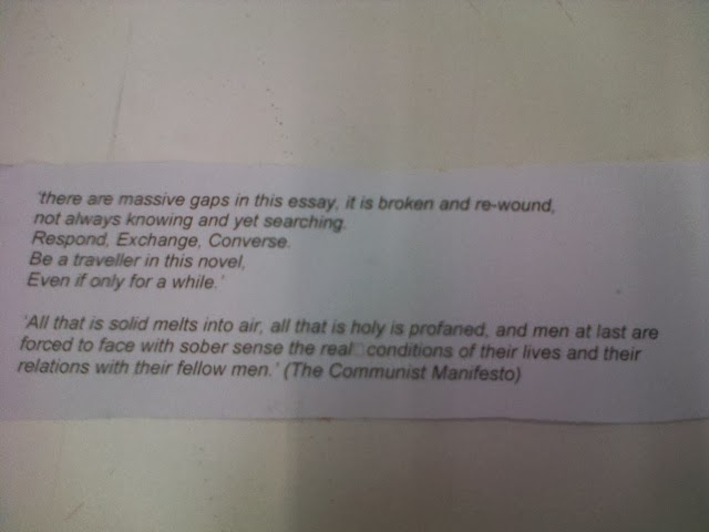
This is the quote of the theme we had to work from.


After brainstorming through the quote the main word that stuck out for the grou was 'traveller' this then led the group to think of  the African curture and the wild animals with unquie patterns, then thought of animals that lived in England like pigeons, foxes etc this was the bases of my Inspiron for my print designs merging African animal patterns with the English animal patterns.
Other inspirations led to think about other aspects of this project using Passport or luggage tags as invitations a Survival Gide (for the jungle/ fashion) etc...

I felt that we had a good starting point for my prints, thinking of re creating a safari theme but instead using British animals so that British customers can relate to the garments.


Friday, 8 November 2013

Fashion&Textiles - Idea development


For this task I had to created designs for clothing out of a random shape for a collection comprised of skirts, detailed sleeves, pockets etc...


This images shows the designs for sleeves, pockets and skirts/ shorts.


Father the initial designs I then had to design a further five development ideas.


These are the designs from the random shapes I created previous.


This project has developed my creativity even more using a random shape to create a full collection. This has opened my mind to more creative designs and will use this method in future.
What I found challenging was bringing the pieces of clothing together trying to match the pieces of clothing together as some designs were completely different from another.


Fashion&Textiles - Photoshop creating my own pattern

6th November


I used this painting by jeremiah kenter as I am a huge fan of disney characters been re produced into a better version of the originally character.


First I used the lasso tool to select mickey mouse and remove that image from the background. I also used the cloning tool as I wanted to make a pattern just out of the background using another image to place ontop of it.


After I clonded the pattern I then added a new layer so that I could add another image over the top


This was the image I used for the new layer.


I also used the lasso tool to cut out Snow white so I can place the image ontop of the background


After I was satisfied with the print I pressed on 'define pattern' as this copies the print and makes replicas next to the origanal (so that I could attach this to a garment).


This is what the print looked like as a pattern.


This was one of the experimented prints I created just using the cloning tool.


I used this dress designed by Alexander McQueen, I felt this pattern from the dress would suit well with the 'Disney' 'Fairytale' theme.


With the cut of of micky I place the image onto the background of the cloned Alexander Mcqueen's dress so that I could create another pattern.


This is another example of 'defining the pattern'.


This was an experiment of just using the cloning tool.


After the first practise of using photoshop I felt more confident in experimenting with a varity of different prints, in my opinion I felt that the Snow White pattern came out the best as when I was placing this pattern on the garment as this pattern inparticular has a diverse appearance to it changing it slitly cresting a new garment all together. I was pleased with the outcome of all patterns I created the colours complemented each other very well. Even though I had used photoshop previous I felt that I still need practise as I used only a few techniques within Photoshop if I had more practise I would of produced more creative patterns this  is one thing that I need to concider in the future.