Tuesday, 5 November 2013

Fashion&Textiles - Development

Development/sketchbook

Why important 
Throught process 
Carrying design information
Progressing ideas
Somewhere to collect notes
Choose sketch book your comfortable with - relating what you want to do 
It's not a sketch book not a scrap book! Your own work not anybody else's work
Initial research happening all the way through 
Gather as much reference material as possible - extra research into another folder more marks 
For this stage the pages will be busy
Layer things I instead of sticking down on sep pages
Avoid mag look for original sources 
Primary - what you looked at first
Secondary source - what someone else did 
Don't leave gaps
Quick notes for me
Less writing much better
Isolate images that influence you
Start on double page
Be experimental 
How someone takes there ideas and develops it
Initial ideas should be rapid
Colours, patterns, Tht rel to the theme
Take photos continuously
The development need to flow with the final piece
Colour and fabrication 
Different methods
Photocopy onto alternative papers
Lift up fold up overlay have things to touch
Be selective
Decoration don't spend to much time on it
Identity of your work
Page interesting to look at
Push ideas forward on each page
Does it inspire me in the next page
Draw over the top of pictures
Back up work 
Put name on the edge 
Put project brief at front 
Get a spray adhesive blue tack at college
Keep s b clean 


The development of an idea I found very easy, I used my necklace to create a varity of different unquie garments including skirts, hats, bags, dresses etc I selected a particular section of the necklace to depict this. I experimented with all angles in finding different designs within it.
I felt that I produces good quality designs but should think about the quantity as well as the quality of my work. Perhaps in furture I will work more with colours as the pages looked abit dull as the only colour I used was silver/grey.
If I had more time I would redo the sewing machine sample as the stitching wasn't even, in future I need to practise more on the sewing machine so my samples will be more aesthetically pleasing.


Monday, 4 November 2013

Photography&Styling - Photo Shoot final images

4 November 


These were the photos I took before I chose for the final images. I experimented with a varity of different clothes, places and poses so that there was a vast varity of images to choose from.


These were the prime inspirations to my final photos.

From the photography and styling day on he 30th I created my final photos using the theme of 'disney' also combining bright colours as Disney films depict a colourful bright nature to them this comes across in the choice clothes and the way I edited the photos. The black and white background depicts the dark side to disney as Walt Disney himself had a very evil side to him.
used a toy inspired from the Audrey Kitching photo (with the big snow tiger) instead I used my finding Nemo toy. The place I chose was in the bathroom as my favourite Disney film is The Little Mermaid and wanted to depict this espeaiclly and I thought the best place to depict this would be I the bathroom as this is the room of water, I also used a fork in the first photo to depict the sence from The Little Mermaid as in one particular scene Aeirl finds a fork and combs her hair with in later on in the movie.


Thursday, 31 October 2013

Fashion&Textiles - Photoshop

Photoshop digital print

Trap lines 
mirroring fashionable at the moment easiest way to create a print
Working with separation and layers screen printing
Resist thech -tie dying 
Block printing 
Roller prints only work to the size of the copper roller 
Digital print  any size colour - erdem flower skirt  dolce and gabbana
Can use the same pattern for different garment and assesaries 
Vectors defines curves smooth lines resolution independent
Bitmap '' dpi dots per inch scale up pixels get larger the image appears more jagged  flat pixels black and white
Lab human eye perspective colour lighting 

Creating the print Pattern
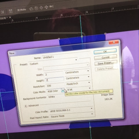
When doing a new file the length and height had to be 4.
Make new file half circle coloured in click pattern to add to the new file

Select all define colour to the pattern on double click change to the coloured circle and background press ok

Snap to jump to

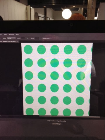
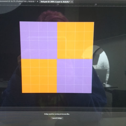
These pictures show the progression of creating a pattern.


I first created a new layer so that I could start my print.


When the layer has a checkered pattern this means that, that layer is transparent. To change this to a full colour you need to click on the layer as it will select that particular layer without changing the other layers you have set up on the same file, once the layer is selected you need to click on the 'edit' and click on the fill button and change the colour by selecting any colour you prefer. This is the same for any other shape or background you need to change by selecting the the particular layer, selecting it and fill in the colour of your choice.
 This is the same method I used for the other patterns (images depicts this below).


From the offset button I selected the clouds cutting them out from its background as the background's colour was uneven. Later I added a even blue colour so that the clouds looked more like a pattern then a picture.


I did the same with the rose as I cut out the rose from its background.


Once I copied the same background I rotated it so that it would look like a dimond shape


I combind the purple and orange poka dot background that I did previously with the rose and cloud pattern I did after to create a more unquie appearance to it.


This was the final out come of my pattern.


I found that Photoshop was very challenging as I'm not used to this program and haven had a lot of practice using it. Once I learned the basic buttons it was a lot easier but I still had trouble remembering the particular tools to use to create the rest of the pattern.
I am happy with the final outcome as the colours work well together as all of the colours stand out on there own, if this print would be used on a garment this would work well to catch people's attention.
In future I need more practise on this program as I will produce more professional prints alongside getting more used to the program I could produce more prints so I would have a varity of different prints so that I would have a better varity of developed ideas.